Hi again! This post is about the progress of each year and the way people react to it. I procrastinated with this data during 2020, isolated at my place. It was July and I saw a lot of people retweeting this tweet:
▓▓▓▓▓▓▓▓░░░░░░░ 50%
— Year Progress (@year_progress) July 2, 2020
If you don’t know the @year_progress twitter account, it’s basically an account that only tweets the percentage of the year that has already passed, represented by a bar, as if you were waiting for the year to load. So, I was curious about which are the most retweeted “progress of the year” bars. Take a second to think about this.
What I expected at that moment was three main type of popular percentages of the year. “Yay, this new year is going to be great”, “WFT, already half/a quarter of the year passed”, and “Thanks god, year is finishing”. Regarding the second group, I expected it to be in round percentaged like quarters (25%, 75%) or multiples of 10% and maybe 5%.
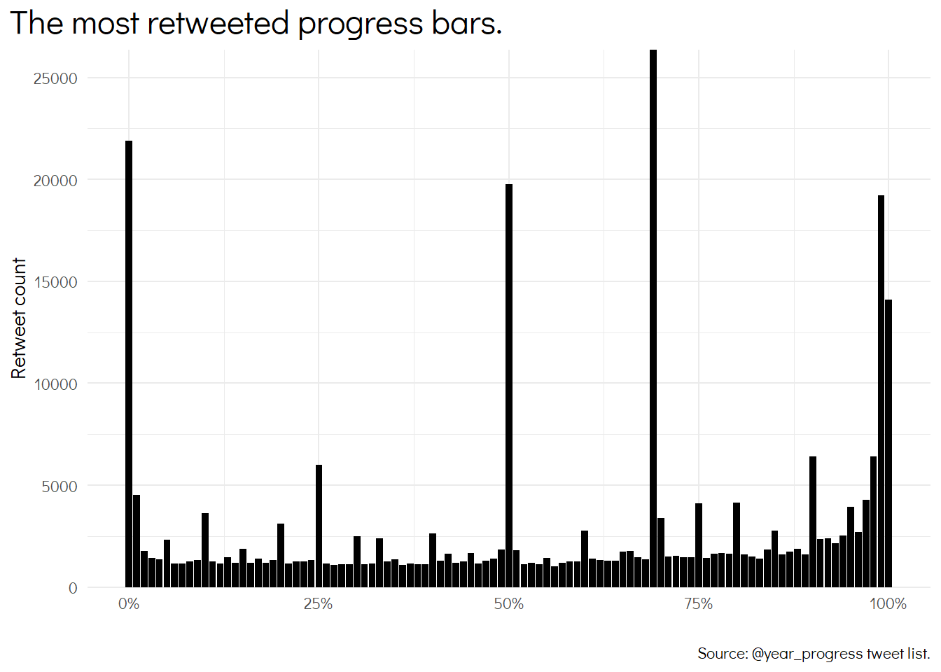
Then, I got the data from twitter and made a bar chart. In this bar chart, I represented the average number of retweets of each percentage of the year, from 0% to 100%.

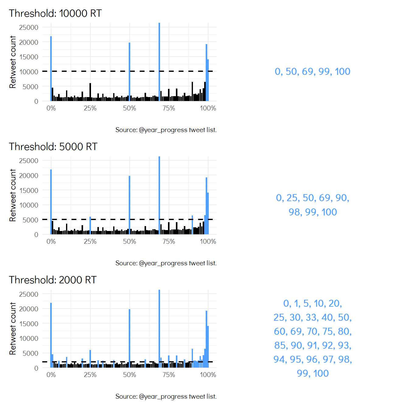
This bar chart shows that there are some particular percentages of the year that are much more popular than the rest. Let’s take different numbers of retweets as thresholds and see which are the percentages that have more retweets (on the right).

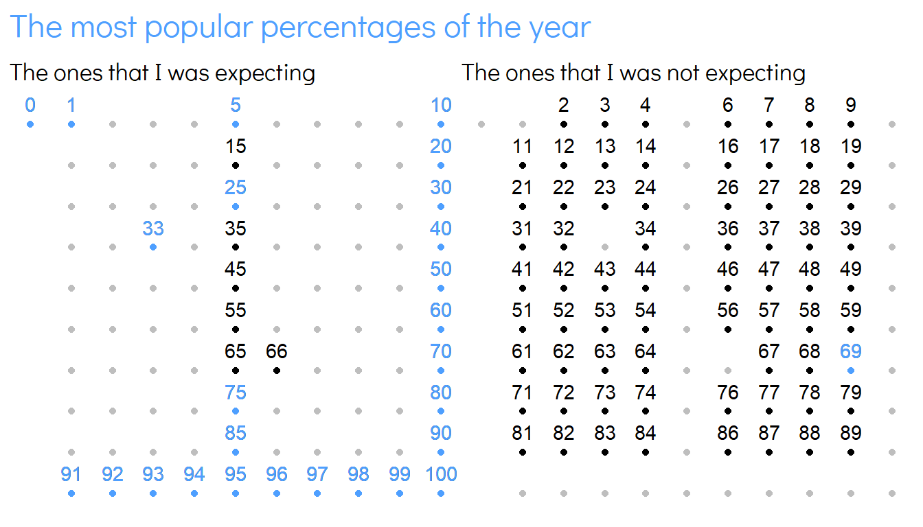
Okay, where is the outlier? To see this, I splited up the numbers into two groups: the ones that I expected to be popular, and the ones I didn’t expect them to be popular. I ploted both in the following figure, the expected on the left, and the not expected on the right. I colored in blue the ones that are actually most popular, and there is only one that stands out from its neighbors: 69%.

69% is a clear outlier, why is it so popular? Well, that’s a sex position number that has become a meme in the internet universe. And then, people are nonsensely retweeting the bar corresponding to 69% because of this. BTW, it took me one hour to realize this fact.
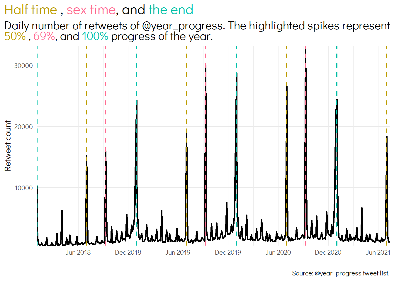
After tweeting these results at that moment, I was asked to plot the number of retweets versus the day of the year to see the spikes. I did it and it was very curious to see that the year was kind of sliced by the spikes. These spikes were representing 50%, 69%, and 100%/0%, instead of the most intuitive 25%, 50%, 75%, and 100%/0%.

Goodbye! Stay tuned for more facts about trashy internet humanity.